

This is a discussion of the basic concepts of the I* metric without encumbering the reader with mathematics. However, it does compare and contrast the I* metric to the color difference model ∆E (Delta-E), and it assumes the reader has some familiarity with color managment, Photoshop’s LAB mode, and the use of ∆E in digital imaging applications.
February 7, 2007
An Introduction to the I* Metric
By Mark H. McCormick-Goodhart
The I* metric (pronounced “i-star”) was invented by Mark McCormick-Goodhart. The I* metric and methods for its use are also the product of several years of imaging research conducted jointly by McCormick-Goodhart, Inc and Wilhelm Imaging Research, Inc. The metric’s chosen letter “I” signifies image information content. The asterisk honors the underlying CIELAB color model and the L*, a*, and b* values used to make the I* calculations. A technical paper on the I* metric and mathematics was published in 2004.1 The I* metric evaluates photographic tone and color reproduction accuracy by comparing a chosen sampling frequency of colorimetric values in one image to the values at corresponding locations in another image of the same scene. One image serves as as the reference image while the other becomes the comparison image. The I* metric was originally developed for image permanence studies where the same image is used for both reference and comparison by measuring it before and then after some aging time has occurred. The compared images may be made by the same or different technologies. Reflection prints, transparencies, images displayed on a computer monitor, LAB encoded digital images, or image files with embedded ICC profiles can be evaluated. When the I* method is applied to digital reflection prints, image resampling and resizing methods are useful to generate representative color patch samples. The samples are subsequently measured on spectrophotometers routinely used in color management work. An example of this technique is illustrated in figures 1a-d.
Color accuracy can be defined in more than one way. Conventional color difference models (e.g., ΔE, ΔE CMC, etc.) narrow the scope of the problem to side-by-side comparisons of two small color fields on a uniform gray surround. Deviation from a perfect match (i.e, loss of accuracy) is scaled by the psychophysical magnitude of the perceived difference between the two colors. A combined weighting of perceived hue, chroma, and lightness differences is used to calculate ΔE values. Color difference equations are very useful in industrial color matching applications such as paint formulation, textile and fabric selection, process control in the graphic arts, etc. However, when evaluating photographic tone and color reproduction, humans rarely isolate and compare corresponding color swatches for color’s sake alone. Rather, we examine how the differences in color induce changes to the perceived information content of the scene. Is an overall shift in color altering the perception of the lighting quality? Do skin tones appear natural in one image and less so in the other? Does the reproduction of highlights, midtones, and shadows alter perceived shapes and details of objects in the scene? In other words, we go beyond just analyzing color differences. We perceive the color differences, but then we judge the image fidelity with respect to our ability to still interpret the scene content correctly. The I* metric therefore approaches image tone and color reproduction accuracy as an information content issue, not merely a color difference issue. The I* metric scales color and tonal accuracy as the percentage of retained color and tone signal conveyed by the patterns of hue, chroma, lightness, and contrast. Global and local image contrast assessment is a very significant part of this evaluation process and an essential requirement for visual pattern recognition. Unlike conventional color difference equations, the I* metric includes chroma weighted color accuracy scaling, colorimetrically defined limits for false color rendering, and a gamma function for the measurement of image contrast. Local image contrast is analyzed by comparing near neighbor lightness (L*) values that are sampled at a chosen spatial frequency.
The I* metric has two functions, one to measure color accuracy and the other to measure tonal accuracy. The color accuracy function evaluates hue and chroma retention. The tonal accuracy function evaluates lightness and contrast retention. The test scores from both functions could be combined to give one overall rank score, but treating color and tone as separate variables reveals more about imaging system reproduction characteristics. Even more insight is gained when the colorimetric data is used to filter the image reproduction for specific subsets of color and tone. I* tests can score specific areas within the image, for example, areas containing only highlights, midtones, shadows, skin tones, red, greens, blues, etc. We can also use the I* method to measure the color and tone reproduction accuracy of specific objects in an image, for example, a person’s face, a bride’s wedding dress, a red sports car, etc.
Figure 1

Figure 1a. Reference image – a digital camera image sized to make a 4×5 inch print at 200ppi.

Figure 1b. I* Reference image data – e.g., 805 color samples and corresponding L*a*b* values extracted from the reference image at 4ppi sampling frequency.

Figure 1c: Comparison Image – inkjet print made on plain paper with printer driver’s plain paper settings. Average overall score: I*tone = 57%, I*color = 59%.

Figure 1d. I* Comparison image data – samples resized and printed with printer driver’s plain paper setting to produce spectrophotometer-readable comparison data.
I* test results are scored on a percentile basis, and there is physical significance to the I* percentages. The scale between 0% and 100% defines practical boundaries for color and tonal accuracy although negative percentages have real meaning as well. Negative I* color values signify false color (e.g., a blue sky turned magenta, brown hair turned green, a red rose turned yellow, etc) while negative I* tone values signify inverted tonal relationships (e.g., as in looking at a photographic negative). Figures 2a-d illustrate the concepts of false color and inverted tonal rendering. Nonetheless, the 0% threshold justifiably means “no color fidelity” or “no tonal fidelity” is retained, whereas a 100% score signifies a perfect match between reference image and compared image. If one considers color information in an image as a signal then hue is analogous to the color signal frequency, and chroma is analogous to the color signal amplitude. Similarly, the spatial information content is essentially carried by the tone signal. Local area image contrast represents modulation in the tone signal amplitude. The I* method of sample selection at equi-spaced distances over the full image area correlates to the sampled spatial frequency of the tone signal. To summarize, the I* metric defines its color and tonal accuracy scores as a percentage of signal quality retention by comparing input signal quality (i.e, the reference image data) to the output signal quality (i.e, the comparison image data). In practice, a relatively low sampling frequency is suitable to evaluate overall image color and tone reproduction accuracy, but higher sampling frequencies, when measurable, can be used to examine a system’s color and tonal fidelity with respect to the recording of finer details in the image.
Figure 2

Figure 2a. Reference image for figures 2b and 2c.

Figure 2b. Comparison Image – a precise color and tone match to the reference image, except for one local image area. The child’s blue dress is now falsely colored green.


Figure 2c. Comparison Image – the L* values between 30 and 60 are inverted, thus causing major image areas of false tonality.
Figure 2d. The tone curve applied to the digital reference image to induce false tonality in figure 2c.
The statistical concept of a distribution curve or histogram rather than an averaged overall result is extremely important in image quality evaluation because problems are often observed to greater or lesser extents in local areas of interest within an image. Viewers respond to both overall color and tonal balance in an image as well as the variations in local areas that may be of special significance to the viewer. For example, overall image color balance may be judged as accurate in an image that nevertheless poorly reproduces the skin tones of a person in the scene. Thus, it can sometimes be misleading to consider only average test scores. Table I lists the I* test results for the plain paper inkjet print reproduction shown in Figure 1c. Table I tabulates average scores for the complete image as well as scores for specific “regions of interest” such as skintones, neutrals, reds, greens, blues, cyans, magentas, and yellows. Scores for highlights, midtones, and shadows are also reported. Additionally, scores for the worst performing 10% of all image data, plus worst 10% itemized region by region, are tabulated. Lastly, the percentage of samples falling below a chosen I* quality level is listed. Values of 20% I* tone and 0% I* color have been chosen as quality control (QC) limits for this calculation. By tabulating average overall I* values, the average I* values of the worst 10% of the samples, and the percentage of samples at or below an I* QC limit, the table indicates the nature of the full distribution curve. Because the data are collected at a chosen spatial frequency, a direct correlation also exists between the Average, Worst 10%, and QC categories and the amount of image area represented by the score. The full image (all data) row in the table therefore also describes how an image has been rendered on average over its total area, how the worst 10% of the image area has performed, and finally, what percentage of the image area is at or below the chosen I* QC limits.
Color Differences, Color Matching, and Information Content
Many digital photographers have already been introduced to color difference models in the form of ΔE values. ΔE values are often used to express an imaging system’s color accuracy. For example, ΔE values are routinely published by digital photo magazines and websites in reviews of digital cameras and photo printers.

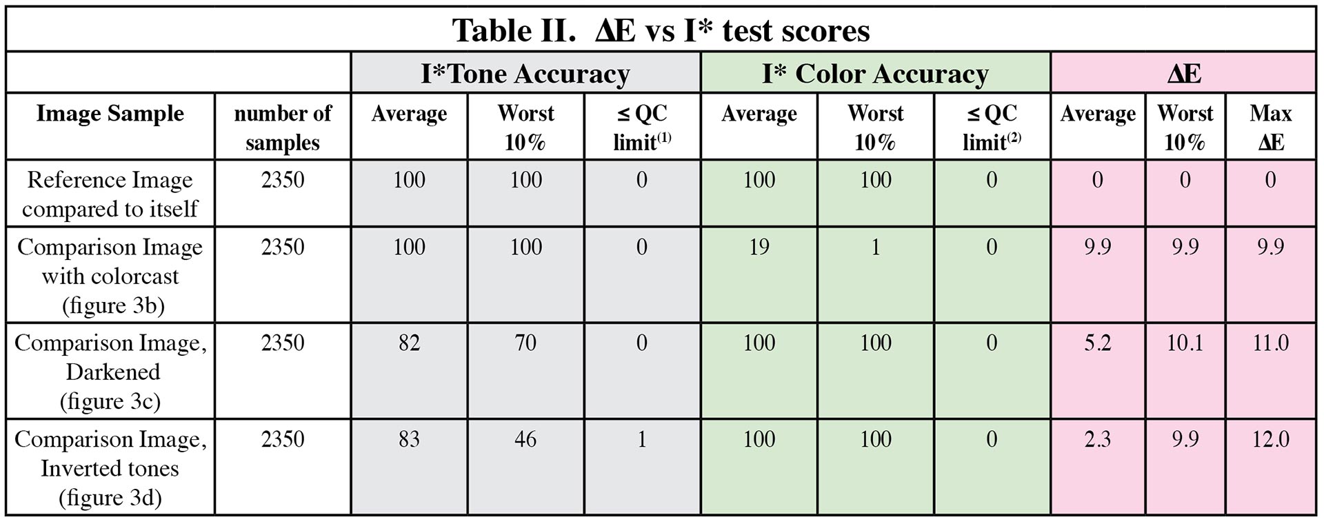
The ΔE equation and some of the efforts to improve upon it such as ΔE 2000 work relatively well at scoring nearly matching colors. However, if you have followed the discussion so far, you may now appreciate that color and tone reproduction accuracy is not strictly about the observance of color differences. Rather, the issue is how those color differences adversely affect the observer’s ability to interpret color information and spatial information within the overall image. Another problem is that color and tone reproduction errors often overwhelm the ΔE scale, exceeding values that most color scientists agree have perceptual scaling significance. Furthermore, there is no ΔE limit to signify 0% color accuracy or 0% tonal accuracy where color and tone relationships are now so different that we begin to draw false conclusions about the image information content. Thus, ΔE is an open-ended scale that loses scaling significance when the ΔE errors become large. It might be argued that huge ΔE errors don’t plague well behaved imaging systems and that systems with large ΔE errors should simply be avoided. Unfortunately, large ΔE errors are unavoidable due to intrinsic color gamut limitations when we make reflection prints and then compare them to their original source image. Those errors can become even more pronounced as an image ages over time. To summarize, photographic color and tone reproduction quality is seldom about exact color matching and usually about the sensible translation of color, brightness, and contrast relationships with respect to the original source image. The colors and tones must deviate from an exact match, yet in a proportional way that retains hue, chroma, lightness, and visual contrast to the maximum extent possible. Reflection prints by their very nature yield significant color differences that push well beyond the useful limits of color difference models. Because ΔE metrics do not measure image contrast and have no weighting function to account for the relative importance of low chroma colors over high chroma colors in establishing image color balance, ΔE scores can lead to erroneous conclusions. The images in figures 3a – d were created to illustrate these problems. Figure 3a is the reference image. Figure 3b is a comparison image suffering from an overall color cast. Figure 3c is a comparison image that has been reproduced a little darker yet without shifts in hue or chroma. Figure 3d is a comparison image with some inverted image tones caused by a curve adjustment in Adobe Photoshop. Figures 4, 5, and 6 show how the reference image file was altered to create the comparison images. An objective of this demonstration was to make comparison images that visually differ from the reference image in easily noticeable ways yet remain within ΔE error limits of 10ΔE or less. 10ΔE is within the functional range that color scientists generally accept as defensible psychophysical color difference scaling. Table II (see page 10) compiles the ΔE and I* metric test results.
The 2,350 color samples used to score the test were taken from each image at the same locations within the image (see figure 7b). The ΔE metric ranks the inverted tone image as the most accurate image reproduction of the three based on average score. A visual assessment of these images clearly shows the inverted tone image is misranked by the ΔE result. Also, as a record of scene content, the image with a color cast and the darkened image can be intuitively corrected in subsequent reproductions, whereas the tonally inverted image produces incongruous scene content that is exceedingly difficult to correct without detailed knowledge of the conditions that caused it. The worst 10% ΔE and Max ΔE statistics are also no help in ranking the images. They tell us that the worst parts of all three images are comparable in loss of accuracy which is clearly not true from an image quality perspective. Finally, the Max ΔE statistics show that the applied Photoshop curves came very close to their objective of not allowing any errors greater than 10ΔE. Because the maximum ΔE score represents just one sample out of 2350, the 2ΔE spread between all three comparison images and their reference image is insignificant. Without our own powers of observation to augment the ΔE results, the ΔE evaluation fails on its own merits to provide any meaningful results. It misranks the images, and we are unable to infer what kind of errors may be occurring or how they affect our interpretation of information content in the image.
In contrast to the ΔE scores, the I* metric scores the color casted image with 100% tonal accuracy but poor color accuracy (19%) over the image as a whole and essentially no color accuracy (1%) for the worst 10% of the image (ie. low chroma colors have changed greatly). The colorcast image has a problem with color accuracy not tonal accuracy. Next, the I* metric scores reveal that the darkened image has 100% color accuracy and good overall tonal accuracy (82%), plus the worst 10% of the darkened image still retains a satisfactory 70% I* tone score. None of the darkened image area has tonal errors that reach the QC limit. Note that 20% accuracy was chosen as a QC limit because 20% I* tone still retains some level of lightness and contrast accuracy that could be restored to higher levels if one were to attempt a subsequent reproduction using the affected image as the source data. Finally, the I* metric shows that the inverted tone image has 100% color accuracy, and a good overall tone score (83%). However, the worst 10% of the image area is now quite poor in tonality, dropping significantly to 46%, and 1% of this image’s samples were detected to be below the I* tone QC limit. Although we cannot confirm false tonality based on the 10ppi sampling frequency used to extract the color samples in this test, some inverted tonality should be suspected due to the numerical spread (i.e., 83, 46, 1) in the I* tone distribution. Based on the I* evaluation, the darkened image has the best overall performance, the color casted image is second, and the inverted tonal image is the most problematic due to a large variation in tonal accuracy. Thus, the I* metric scored these images and provided insight into the reproduction errors consistent with what we visually perceive is occurring in the images.
Figure 3

Figure 3a. Reference image for comparison images in figures 3b,3c, and 3d.

Figure 3b. Comparison image – the image has a significant colorcast, but lightness and contrast are unchanged.

Figure 3c. Comparison Image – the image has been darkened (more in the midtones), but the color balance is unchanged.

Figure 3d. Comparison image – the image has a tone inversion affecting some midtones, but the color balance is unchanged.
Figure 4

Figure 4a (same as figure 2a). Reference image.

Figure 4b. Comparison Image – same image as in Figure 3b. The color cast was induced by the Photoshop adjustment curves shown in figure 4c.


Figure 4c. Linear shift of all image colors by -7a* units and +7b* units in the comparison image of figure 4b. The ∆a*b* shift with no change in L* from the two applied curves produces a maximum ∆E equivalent to the average ∆E for the whole image. The color difference over the entire image is ~10∆E.
Figure 5


Figure 5a. Comparison Image – same image as in Figure 3c. The image was darkened by applying the curve shown iin figure 5b.
Figure 5b. Tone curve applied to the digital reference image darkened the image without shifting color balance. Maximum color difference errors are ~ 10∆E .


Figure 5c. 5x enlarged portion of the Reference Image.
Figure 5d. 5x enlarged portion of the darkened comparison image.
Figure 6


Figure 6a. Comparison image – tone inversion has been induced by the Photoshop adjustment curve shown in figure 6b.
Figure 6b. Tone curve applied to the digital reference image creates inverted midtones. Maximum color difference errors are still ~ 10∆E .

Figure 6c. 5x enlarged portion of the Reference Image.

Figure 6d. 5x enlarged portion of the tone inverted comparison image reveals the serious tone reproduction errors caused by the tonal inversion.
Influence of Sampling Frequency
The inverted tones in the comparison image shown in figure 3d were induced by a Photoshop curve adjustment that affected a narrow range of lightness values in the image (i.e, 50L* to 60L*). These specific L* changes were visually manifested in the children’s and Santa Claus’s skin tones as bright bands or “halos” at edges. Sampling the overall image at 10ppi was enough to detect significant tonal variations with the I* metric, but the observer’s visual ability to notice the problem and the I* metric’s probability of detection are both increased simply by evaluating the image at a higher magnification. Figures 7a-d illustrate the original 10ppi sampling frequency used to extract 2,350 samples over the entire image plus an increased 50ppi sampling frequency used to extract 2,350 samples from a 5x cropped portion of the image. Note that the reference image data must also be resampled from the same cropped portion of the scene to make the correct comparison. Table III lists the ΔE and I* evaluations for both sample populations. The results show that the ΔE analysis detects greater color difference on average in the cropped portion compared to the total image area, but little increase in worst 10% or maximum ΔE. The I* tonal score drops significantly from 83% on average to 65% accuracy and the worst 10% of the samples from the cropped portion are now at -23%, a clear confirmation of inverted tones. Also, 9.8% of the cropped portion of the image is now revealed to be at or below the I* tone QC limit. This result shows that the cropped portion of the image is much worse than average compared to the whole image, and indeed it was chosen because it has strange tonal effects in the skin tone areas of the child as compared, for example, to areas in the background scene. When tone and color errors affect fine details in an image more so than large areas (e.g., edge effects and changes in image sharpness) an increased sampling frequency is beneficial to detect these problems with greater certainty. Fortunately, the typical tone and color reproduction errors that affect reflection print systems tend to affect large and small areas alike, so high frequency sampling is generally not needed to conduct a meaningful I* analysis. Nevertheless, these results show that the I* metric can be extended for use with high frequency analysis when sample extraction is possible. High frequency sampling is often possible when dealing with digital image data rather than data measured directly from reflection prints.
Another way of thinking about the results listed in Table III is that the cropped portion of the image is in itself a new image. This new image has different percentages of image area dedicated to specific colors and tones than the full image from which it was derived. Because the I* method evaluates individual image performance one should expect an individualized I* score for the cropped image to differ from its full image counterpart.
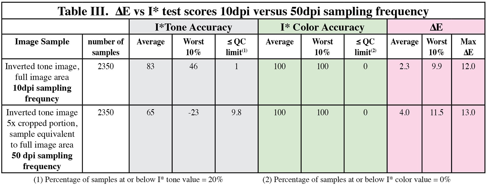
Figure 7

Figure 7a. Comparison image – the tone inverted image shown previously in figures 3d and 6a.

Figure 7b. 2,350 color samples extracted from the comparison image at 10ppi sampling frequency.

Figure 7c. 5x enlarged portion of the inverted tone image shown above in figure 7a.

Figure 7d. 2,350 samples extracted from the 5x enlarged portion. This new sample population equals 50ppi sampling frequency in the full image.
Chroma Weighting in the I* Color Function
The I* color function includes a chroma weighting factor that allows increasingly greater Δa*b* errors as colors become more vivid. In other words, neutral colors in a scene have very little Δa*b* room to move before they lose the appearance of neutrality, whereas highly saturated colors can move more because their color signal strength isn’t compromised as much by the same Δa*b* shift. Thus, the I* color function is unlike color difference models because it takes into consideration the initial chroma of the colors when calculating color accuracy. In fact, the I* color function works similar to Adobe Photoshop’s hue/saturation tool. When one applies a Photoshop hue/saturation edit in LAB mode, the a* and b* values shift on a percentage basis of their initial values. This percentage-wise method of altering the image for hue and/or saturation allows perfect neutrals (i.e, a* and b* equal zero) to remain neutral because multiplication by zero is still zero. Yet the overall visual effect of the percentage-wise hue/saturation adjustment looks perceptually linear even though it means that ΔE values become increasingly larger in proportion to initial a* and b* values.
Figures 8a-e illustrate the difference between colors judged in isolation and colors judged in a scene context. Figure 8a is a set of “paint chip” colors identical to colors found in the image of Santa Claus and the children. The 10ΔE color cast applied in Photoshop as per figure 4c has been applied to these colors as shown in the second row of figure 8a. Next, the same colorcast has been applied to the reference image in figure 8b but selectively rather than globally so that:
1) in figure 8c, only the low chroma colors (walls, window sill, Santa’s beard, etc) have the color cast.
2) in figure 8d, only the skin tones areas (i.e, faces, arms, and hands) have the 10ΔE color cast.
3) in figure 8e, only the vivid colors, (found in the gift wrapping and all clothing colors) have the 10ΔE colorcast.
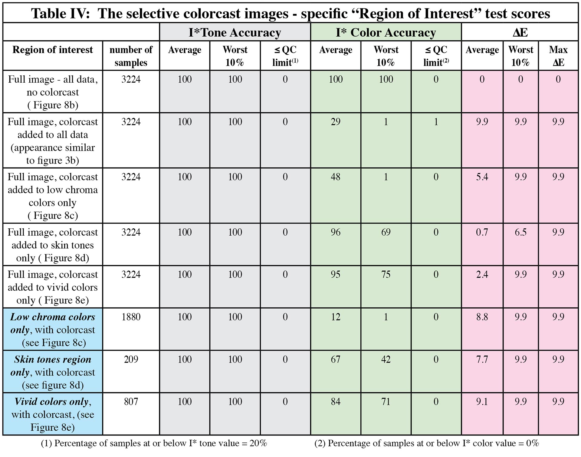
The “paint chip” color swatches confirm that in isolation and as the ΔE model predicts, 10ΔE is observed with similar degree of visual magnitude for all the color patches, whether they are high or low in chroma. However, once placed in context in a photographic image, we interpret the impact of these color differences very differently. When the low chroma colors are altered (figure 8c) we interpret a distinct shift in scene color balance. The lighting in the scene now appears to be very yellowish-green in nature. Inability to adapt to the scene illumination rarely occurs in real life to the extent we see reproduced in this image, and when it does, the color quality of the light must be so strong that not only would the walls and window sills look tinted, but the skin tones and clothing should appear to be “bathed” in the same light. The image in figure 8c thus appears to be significantly wrong in color fidelity with respect to its reference image or to any scene we might normally encounter. In figure 8d, the same colorcast is now applied only to the skin tones in the scene and nowhere else. The correctly reproduced low chroma colors help us to establish a normal sense of the scene lighting. The skin tones now appear to be reflecting too much greenish-yellow light in comparison to the overall scene, but their initial moderate chroma levels helps them to hold up against the 10ΔE color shift better than the low chroma colors. We can still accept them as skin tone colors even if they aren’t entirely accurate. Finally, in figure 8e the color cast has been applied only to the vivid colors in the scene. The vivid colors are present mainly in the clothing and the gift wrapping. Despite the fact that these affected colors occupy a large area of the image, their 10ΔE errors do little to through off our sense of scene color content like the low chroma wall colors or the moderate chroma skin tones did when they possessed the same ΔE color shift. Table IV itemizes the I* and ΔE scores for these images. Sampling frequency was 15ppi for a total sample count of 3,224 colors over the total image area. Also in Table IV, specific “regions of interest” (see column 1 cells marked in blue) narrow the analysis to only those color samples that belong to the select image edited areas as per figures 8c, 8d, and 8e. The percentage of image area affected by the image edits can be estimated by dividing the full sample count by the selected sample count. For example, the 10ΔE local color cast applied to the skin tone areas in Figure 8d affected 209 color samples, and 209/3224 represents approximately 6.5% of the total image area. In comparison, the application of the 10ΔE color cast to the vivid colors in figure 8e affected 807/3224 colors or 25% of the image area. The average I* color score for these two images is comparable (i.e., 96% vs 95 %) which indicates two things. First, the majority of the image area was unaffected by the local image edits, so overall accuracy is very high. Second, the contribution of different regions of interest to the overall average I* score is weighted both by area coverage and magnitude of the I* values. When we examine the worst 10% statistics, we see larger differentiation between the two images (i.e. 69% versus 75%) whereby the image with colorcasted skin tones is now rated with a lower (poorer) score. Thus, even using full image area statistics the I* color function rates figure 8c worse than 8d, and 8d worse than 8e. If we now examine these images in even greater detail by isolating the image edited regions of interest as listed in Table IV, the I* method ranks the order of color accuracy in these images with even more certainty. In comparison, the ΔE scores rate the image with colorcasted skin tones (figure 8d) more favorably than the image with colorcasted vivid colors (figure 8e). Look at the images in figure 8 and see whether you agree.
Figure 8
Santa Image “Paint Chip” Colors
Chroma =
Reference image colors:
10∆E color shift added as per comparison
image with colorcast.
Blue Dress
36.5
Skin Tone
22.7
Wall
5.0
Santa’s Suit
59.6
Boy’s Suit
69.3
Figure 8a. When removed from the context of a photographic image amd placed side-by-side on a gray background, the 10∆E color shifts in various scene colors within the reference image appear similar in magnitude as the ∆E equation predicts. When placed in photo context (see below), the viewer’s interpretation is very different.

Figure 8b. Reference image – cropped so that high chroma colors occupy more image area.

Figure 8c. 10∆E colorcast applied only to low chroma areas.

Figure 8d. 10∆E colorcast applied to skin tones (moderate chroma) only.

Figure 8e. 10∆E colorcast applied only to high chroma areas.
Consider rating the images in figure 8 for color accuracy without the presense of the reference image shown in figure 8b. Figure 8c with its affected low chroma colors would be easily judged to have significant color accuracy problems based on two known memory objects in the scene. Santa’s white beard and white gloves shouldn’t appear as greenish yellow as the walls if the walls are indeed painted non-white in color, but the skin tones should reflect more of the greenish-yellow light if the illumination really is this color temperature. Thus, we can easily interpret a color cross-over effect and conclude that there is a significant color accuracy problem in the image. Next, the image in figure 8d would seem plausible but skin tones would be judged as less than optimum. They have the opposite problem of figure 8b. They appear to be reflecting more greenish-yellow light than we can now detect in the low chroma colors of the walls and window sills. This single stimulus judgement takes into account the fact that skin tones are indeed “memory” colors. We have learned from experience to expect certain skin tone colors within a range of colors that encompasses both ethnicity and scene lighting conditions. The 10ΔE error has not thrown the skin tones completely out of range, so skin tone areas in the image retain some color accuracy, but they don’t appear to be highly accurate. Lastly, consider the image in figure 8e where all clothing including Santa’s red suit has been contaminated with the 10ΔE color cast. To those of us who are aware of Western culture and St. Nicholas, Santa’s red suit, white beard, white gloves, and rosy cheeks are also “memory colors”. Yet the 10ΔE error in the red suit has not caused a serious challenge to our memory color perception. We don’t sense the color cast in his red suit like we did when the walls took on the same ΔE shift, both in magnitude and in direction of the Δa* and Δb* errors. The reason is perhaps best explained by considering color signal strength, as embodied in the chroma weighting function of the I* color function. The colorcast signal overwhelms the low chroma color signal strength but is much less intense than the vivid color signal strength. We see Santa’s red suit color mostly intact as are the color signals of the other clothes and thus interpret the scene color content similarly to the interpretation we get when looking at the reference image shown in figure 8b.
Final Remarks
The I* metric calculates accuracy only, not whether the viewer finds the reference or comparison images pleasing. The choice of reference image is typically one that has optimized tone and color qualities for the chosen output media, but pleasing image quality in the reference image is not a requirement. If the viewer prefers the comparison image over the reference image, the I* analysis will seem at odds with viewer preference because by definition, any changes in the comparison image away from the color and tonal relationships in the reference image constitute a loss of accuracy.
I* scores are image dependent, and rightly so, because the proportions of different colors within an image are scene dependent. For example, the image in figure 1 contains a significant amount of red (pink) colors that might be entirely absent in another image. When reproduced on a system with poor red and magenta reproduction this image might suffer in quality compared to images that favor other colors. The assessment of both initial image quality and image permanence (i.e., image quality retention over time) are indeed influenced significantly by the choice of image.

Because photographic images have physical limits for minimum and maximum lightness values, changes in lightness anywhere along the tone reproduction curve automatically cause contrast changes in images that possess a full lightness range. A simple calculation of contrast by comparing changes to L*min and L*max is not adequate. Localized changes in image contrast cause local areas of information content loss within the overall image and can only be identified by evaluating lightness relationships between neighboring picture elements. The color samples must therefore be analyzed at a chosen spatial frequency by collecting data at equally spaced distances over the entire image. In so doing, the contribution of various color and tonal errors is weighted according to the amount of area the errors occupy within the image. Figures 1b, 1d, 7b, and 7d illustrate the equi-spaced color sampling technique. An exception to this image sampling technique is when a generic test pattern consisting of a predefined array of color patches (and, consequently, predefined local contrast relationships) is used to evaluate system performance. Figure 9 shows an example of a standardized test pattern used by Aardenburg Imaging. It samples 12 separate hues with varying lightness and chroma. The chroma increments were carefully selected to reproduce in the sRGB color space without color gamut compression. This test image also has three additional “skintone” hues with varying lightness and chroma, plus neutral and near neutral colors. In the lower right corner, the target also contains 24 color patches with the same d50 LAB colors and geometric arrangement of the Macbeth Colorchecker™ chart. Note that the only exception to in-gamut sRGB relative rendering of this file is the cyan color patch in the Colorchecker patches. It undergoes a slight amount of chroma reduction. The I* metric can be used to evaluate the Colorchecker chart as a special region of interest within this larger test target. Also, note the physical amount of image area dedicated to skin tones and gray/near gray colors which gives these colors extra weighted importance in an I* evaluation of this target image.
It is possible to reproduce images with 0% I* color accuracy yet high I* tone accuracy. Converting a color image to a black and white image is a classic example of stripping a color photograph of its color information while retaining its tonal information. Thus, for scholarly purposes where spatial recognition of objects is important, the retention of high I* tone values is often more important than the retention of high I* color values, but in applications where color fidelity is essential then the retention of high I* color values can be equally important.
References
1) Mark McCormick-Goodhart, Henry Wilhelm, and Dmitriy Shklyarov,“A ‘Retained Image Appearance’ Metric For Full Tonal Scale, Colorimetric Evaluation of Photographic Image Stability,” IS&T’s NIP20: International Conference on Digital Printing Technologies, Final Program and Proceedings, IS&T, Springfield, VA, October 3–November 5, 2004, pp. 680–688. (available in PDF format at Aardenburg-Imaging.com).
About the Author
Mark McCormick-Goodhart has over thirty years of professional experience in imaging and materials science and holds eight U.S. patents in the field of imaging science and technology. He has also published over 30 papers related to imaging science and photographic conservation. Photography and printmaking has been his special interest for over forty years. From 1988 to 1998, he was the Senior Research Photographic Scientist at the Smithsonian Institution in Washington, DC. In 1996, Mark co-founded one of the first fully color-managed digital fine art printing studios, Old Town Editions, in Alexandria, Virginia with colleague Chris Foley. From 1998-2005, Mark collaborated with Henry Wilhelm of Wilhelm Imaging Research, Inc. to develop new image permanence test methods for evaluating modern digital print media. Since founding Aardenburg Imaging in 2007 to begin industry testing using his invention the i* metric, Mark has established AaI&A as the world’s most advanced image quality and image permanence testing facility.

